7 Mistakes in Form Design that Hurt Your Form's Conversion Rate
Creating forms that users complete is essential for anyone aiming to generate leads, sales or engagement. Unfortunately, many forms suffer from common design flaws that negatively affect the form conversion rate. By understanding and avoiding these pitfalls, you can enhance user experience and significantly improve form conversion. Based on our own experience, we've collected seven biggest mistakes in form design. Below we talk about each mistake in detail and offer solutions to fix it.
1. Asking for too much information
Mistake
Overloading in form design. Asking for too much information can overwhelm users, leading to abandonment. Each additional field you add increases the friction and the likelihood of a user dropping off.
Solution
Stick to the essentials. Only ask for the information you absolutely need. This is a crucial step in conversion rate optimisation.
Example
Let's take a contact form as an example. Many contact forms include an overwhelming number of fields, such as full name, email, phone number, address, company, job title and a detailed message. To streamline this form design, only request the user’s name, email, and a brief message.
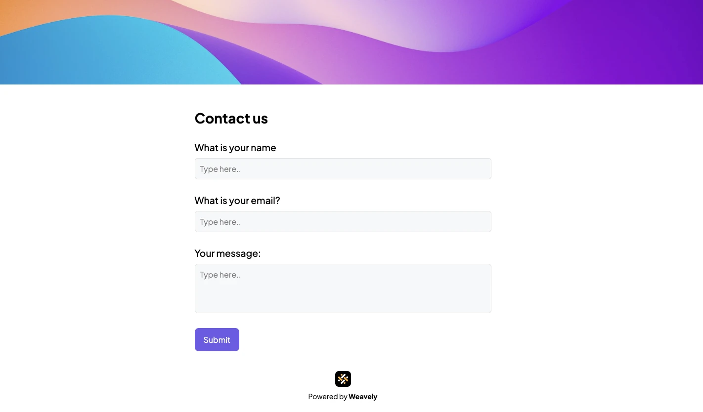
In case getting more information about the respondent is crucial, you can optimise the form with drop-downs and checkbox buttons, like in the example below. This form allows you to collect all necessary information in an efficient and user-friendly manner.
2. Unclear labels and instructions
Mistake
In form design, labels and instructions are essential elements that guide users in filling out the form correctly. Lack of guidance can confuse users and make them unsure how to fill out the form.
Solution
Include clear, concise labels and instructions. A user-friendly form design always offers hints and examples to guide users through the process. For example, a label "address" might be unclear. Make sure to specify if you only need to know a city, a postal code or a full address.
Example
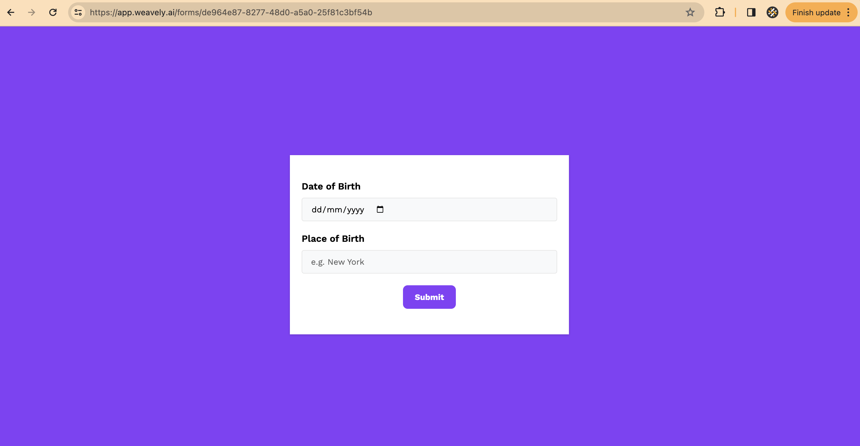
If a field requires a specific format (e.g., date of birth), show an example next to the input field or as a placeholder, as there are multiple ways to write the date depending on the country your respondents are from.
3. Not making your form look on-brand
Mistake
Using generic or inconsistent styling that doesn’t align with your brand can reduce user trust and engagement.
Solution
Customise your form to match your brand’s colours, fonts, and overall aesthetic. A form that looks on-brand creates trust and leads to optimised conversion rates.
Example
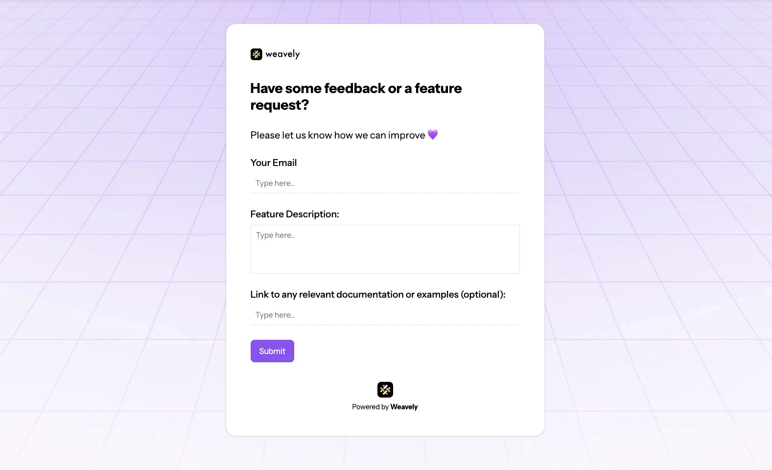
Use your brand’s logo, colour scheme and typography in the form design to ensure consistency with your other company assets. Although it is a very basic example, this form contains Weavely’s brand elements like grid background, font, logo, custom colours, which immediately makes it recognisable for our users.

4. Poor mobile optimisation
Mistake
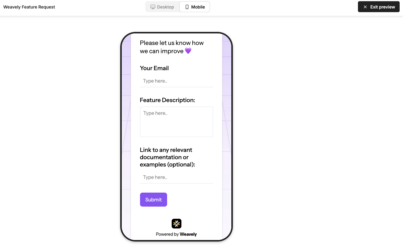
Ignoring mobile users by not optimising your forms for mobile devices can lead to a poor user experience. Forms that are not mobile-friendly can be difficult to fill out on smaller screens, leading to higher drop-off rates.
Solution
Ensure your forms are responsive. Use larger touch targets and vertical layouts to make forms user-friendly on all devices.
Example
5. Unclear error messages
Mistake
Vague or technical error messages frustrate users and can definitely lead to form abandonment. It’s
Solution
Provide clear, specific error messages. Indicate exactly what went wrong and how to fix it. This improves the overall user experience and helps with conversion rate optimisation.
Example
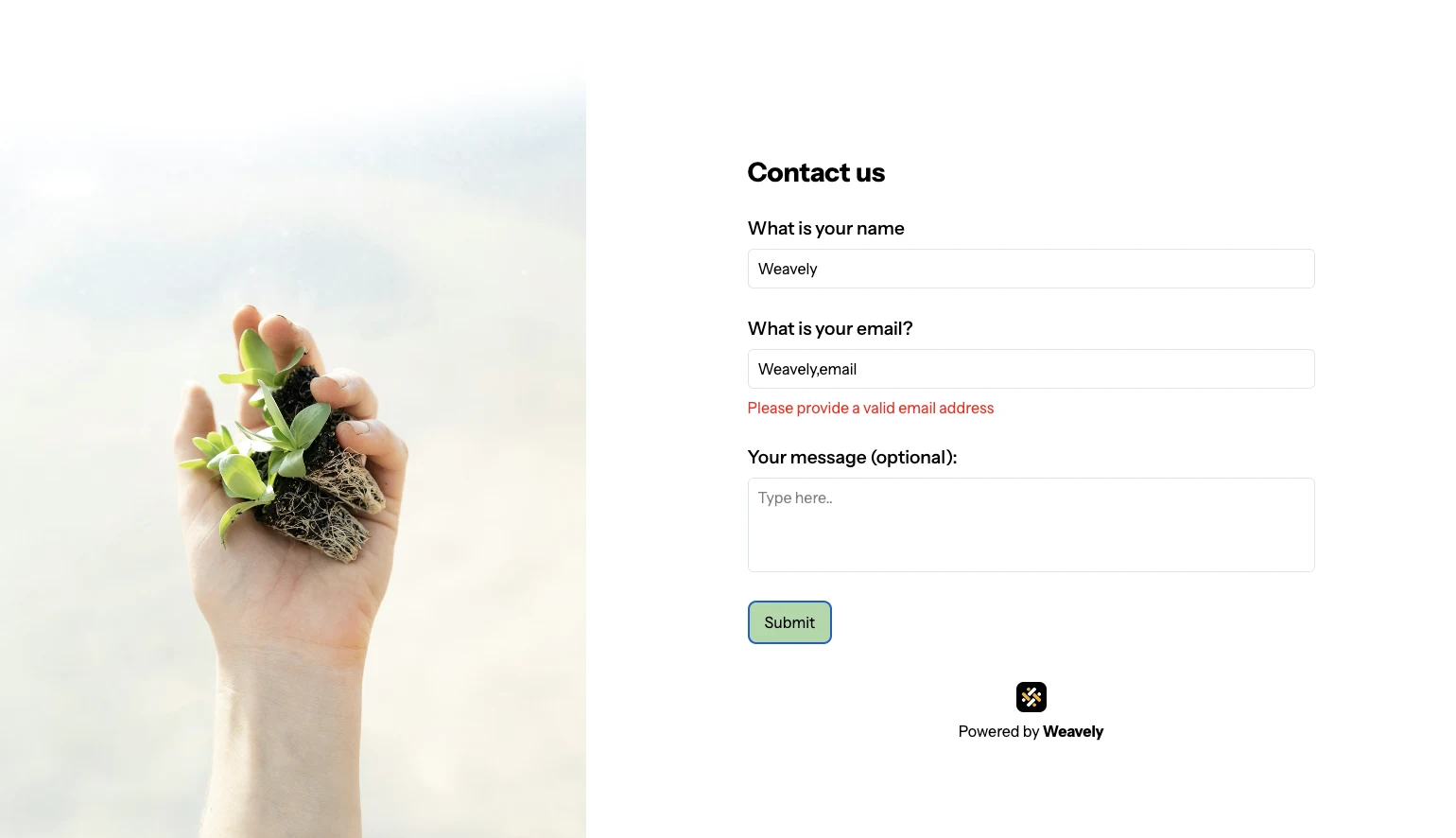
Instead of saying "Invalid input," specify "Please enter a valid email address."
6. Ignoring form design best practices
Mistake
Overlooking design principles, being inconsistent in your design style (e.g. fonts, font size, colours) and cluttering the form with unnecessary elements.
Solution
Follow form design best practices to create a user-friendly form, which includes logical field order, appropriate field lengths, spacing and avoiding clutter. These simple steps can significantly improve your form conversion rate.
Example
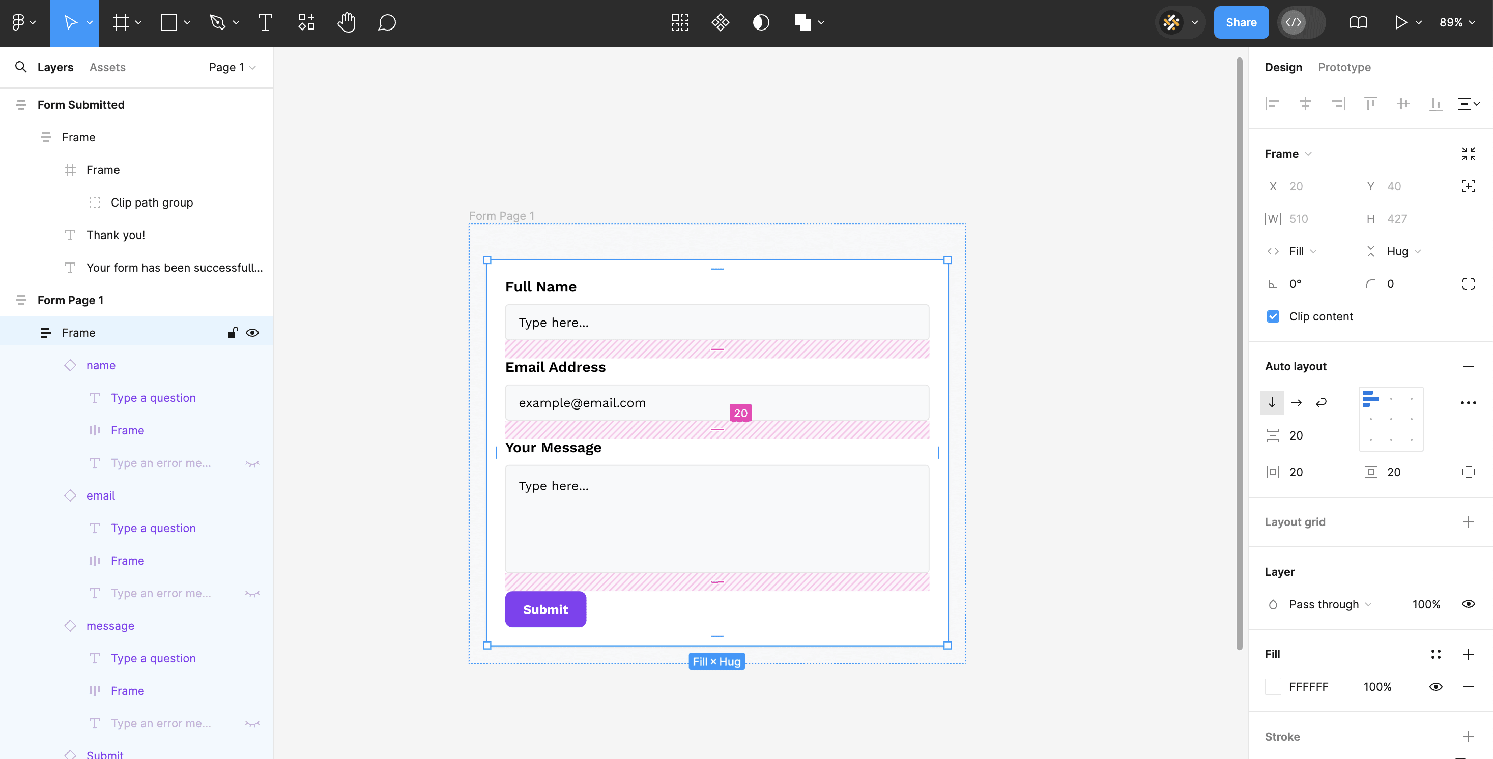
Ensure consistent vertical spacing between fields to create a clean layout. Whenever you create space between elements, it should be divisible by four. A common guideline is to use 16-24 pixels of vertical space between each field. For example, in the Weavely template of a simple contact form we use 20 pixels.
7. Failure to communicate form value
Mistake
Not explaining why users should fill out the form.
Solution
Clearly state the reasons and/or benefits of completing the form. Whether it’s receiving a free ebook, getting a discount or just leaving feedback, make sure users know what they’re doing and why.
Example
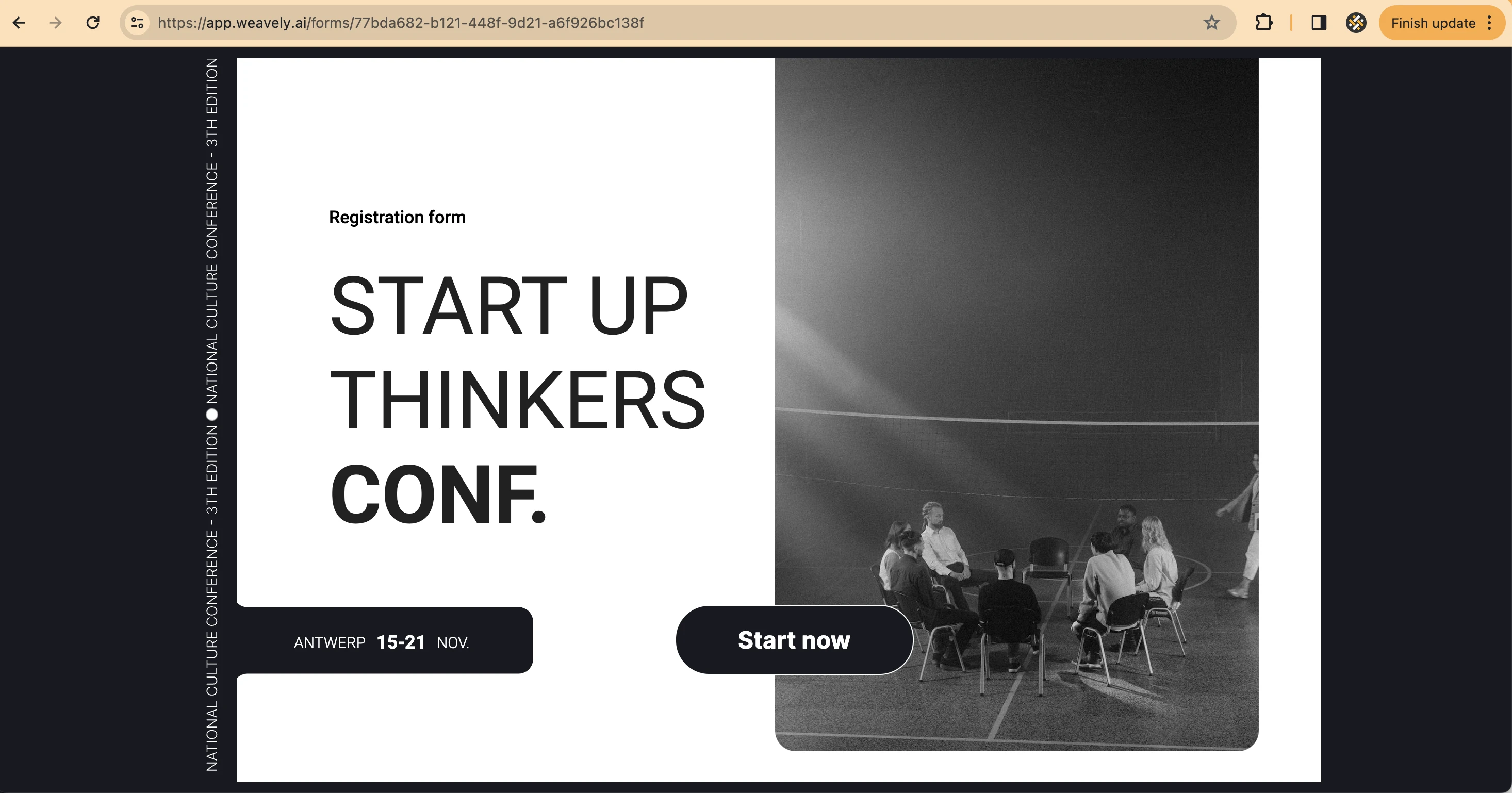
Add a brief description at the top of the form that highlights the value proposition. Or create a multi-page form where the first screen is a cover of your form that has a clear value proposition and invites users to fill out the form.
Ready to optimise your forms and boost your conversion rates? Try Weavely, an AI form builder that creates custom forms and surveys from a single prompt.

