Forms for Landing Pages: Embedded Form or Pop-Up?
When it comes to designing a landing page, one of the most critical elements is the form you use to capture leads, gather feedback, or drive conversions. But should you go with an embedded form that sits right on the page or a pop-up form that grabs attention as users navigate your site? Both options have their strengths and weaknesses, so let’s explore which might work best for your needs.
Embedded forms: seamless and always visible
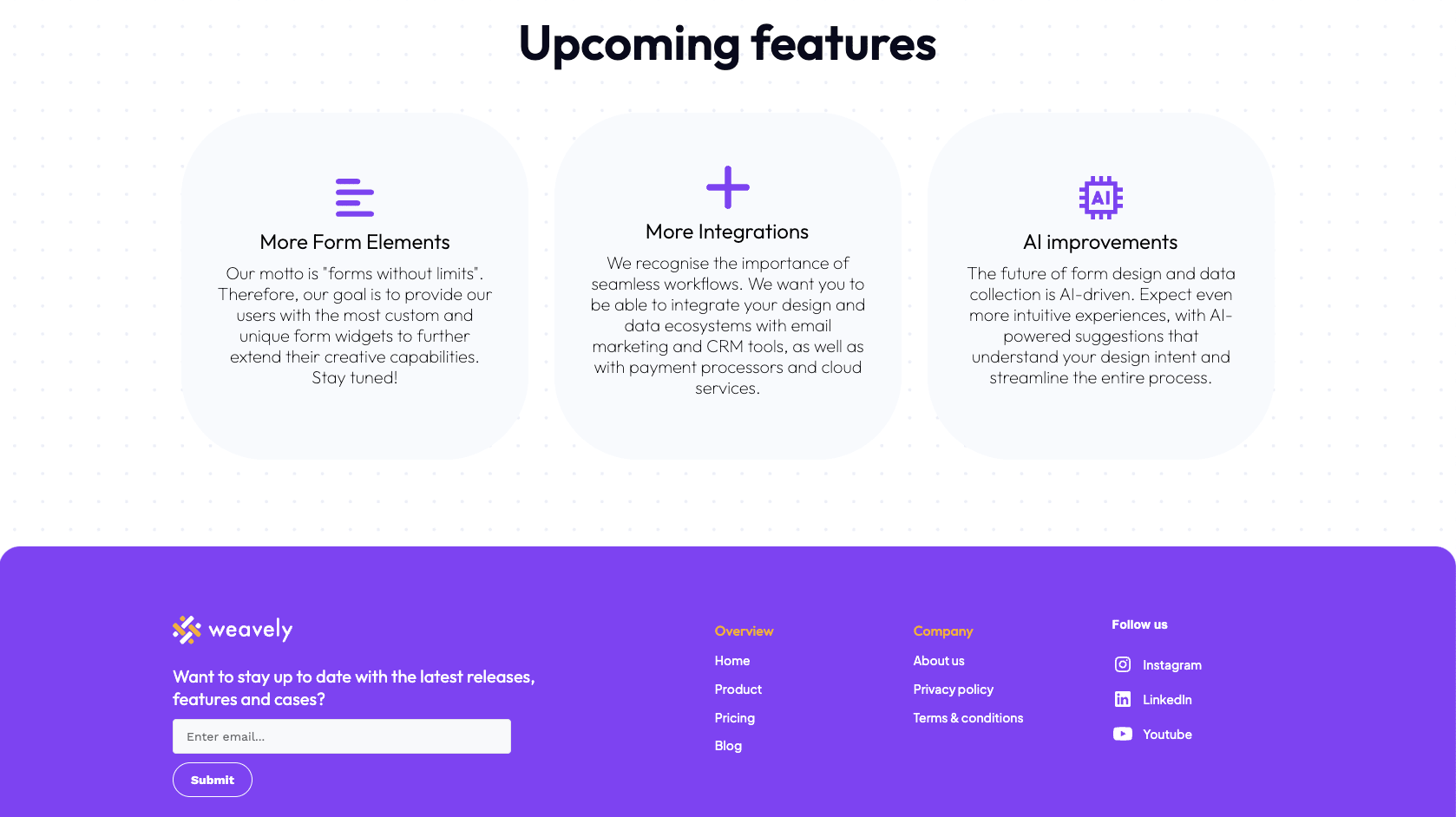
Embedded, or in other words inline forms are integrated directly into your landing page, making them a natural part of the user experience. They’re always visible, and users can fill them out without any additional clicks or interactions. For example, the footer in the screenshot below contains an embedded “newsletter sign up” form.

Pros of embedded forms
Because embedded forms are part of the page layout, they don’t interrupt the user experience. Psychologically users are more likely to complete a form that they come across naturally rather than one that disrupts their browsing.
In addition, embedded forms can be aligned with the content on the page. This makes them more relevant to the visitor and potentially benefits SEO. For instance, place a form asking for feedback at the end of an article where the user has just read the content.
Another benefit of putting your form on a page is linkability and sharing. You can directly link to an inline form that allows users to share the page with the form. Equally, if you have a specific landing page with an embedded form, it can be promoted through various channels.
Lastly, an embedded form often attracts higher-quality leads. A person who proactively fills out your form is likely more engaged and valuable than someone who was simply prompted to leave their email address in a pop-up form.
Cons of embedded forms
However, if the form is placed too low on the page or doesn’t stand out visually, users can simply ignore it. Doesn't sound like the best option for lead generation, does it?
Another consideration, though not necessarily a downside, is the need for your form to look on-brand when embedded on your landing page. Using generic forms or templates can appear unprofessional. Therefore, to maintain brand consistency, it’s essential to consider the colours, fonts, and visual elements used in your forms. With Weavely, you can simply upload your logo or a branded image, and the platform will automatically apply your brand’s colours and styles.
Pop-up forms: noticeable and action-oriented
Pop-up forms, on the other hand, are designed to catch the user’s eye by appearing over the page content. They demand attention and can be highly effective in prompting action. Here’s what to consider.

Pros of pop-up forms
The biggest advantage of pop-ups is that they are hard to miss, and hence, are great for capturing user attention. This way, pop-ups increase engagement and allow for receiving a higher volume of responses.
Another benefit is their flexible placement. You can choose when and where exactly the form appears, maximising its impact.
Finally, pop-ups create a moment of focus where the user is more likely to engage with the form. This means pop-ups are great for gathering instant feedback directly from users. For example, a simple multiple-choice survey could quickly reveal how user-friendly visitors find your website, etc.
Cons of pop-up forms
Of course, the most obvious downside of pop-up forms is that many people find them actively annoying. While a visitor is concentrated on the content of your landing page, a form that pops up and covers the whole screen definitely ruins the user experience.
This leads to the second disadvantage which is the risk of dismissal. Some users might close the pop-up without even reading it, especially if it appears too soon, too frequently, or covers up the whole page.
Finally, in contrast to inline forms, pop-ups might attract lower-quality leads. Someone who fills out a form simply because it appeared on their screen may be less engaged than a person who actively seeks out and completes an embedded form.
So, an inline form or a pop-up?
The choice between an embedded form and a pop-up largely depends on your goals and the context of your landing page. Both options have their own advantages and downsides, so the right answer only lies in the nature of your case.
Use an embedded form if you want it to drive a longer-term engagement, for forms that you expect users to come back to or that serve as a part of a content-rich page.
Use a pop-up form if your priority is to capture attention quickly and maximise the number of responses, such as when collecting email sign-ups or running surveys that benefit from higher participation rates. However, even the most attention-grabbing pop-up will not be effective if it is thrown at users aggressively. Make sure your form pops up at the right time, page and placement.
Embedding forms with Weavely
Whether you decide on an embedded form or a pop-up, Weavely offers both solutions. With Weavely, you can build fully customisable interactive forms that match your brand identity. Our new pop-up feature allows you to create attention-grabbing forms that can be precisely positioned on your website. Give it a try!

