The Glassmorphism Design Trend in Figma for 2025
Glassmorphism design, it's the talk of designer town for 2025. Don't just take our word for it, here's what Google Trends has to say about it!
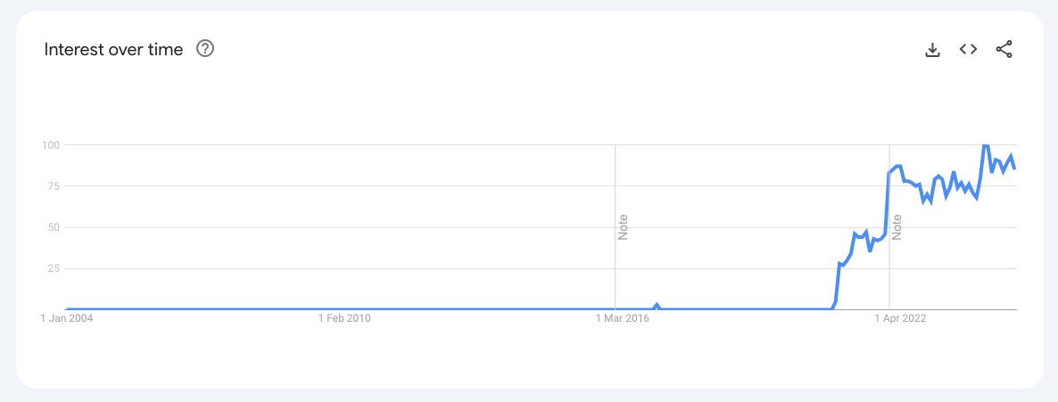
In case you don't know what it is: glassmorphism is a trend in ui design. It utilises frosted glass effects, transparency, blur, and vibrant backgrounds to create depth and elegance in user interfaces. The trend gained traction with the introduction of translucent design systems in operating systems like Windows Vista and iOS 7. These showcased how transparency can enhance user experience by creating visually engaging interfaces.
In this post, we will explore how UX and UI designers can effectively implement glassmorphism using Figma. We'll give you a hands-on guide that caters to both beginners as well as seasoned designers.
Characteristics of Glassmorphism
We'll shortly dive into creating glassmorphic elements in Figma, and look at some real world examples. But, let's first outline what we think are the key elements of glassmorphism:
- Transparency and Blur Effects: These are essential for achieving the frosted glass look and glassmorphism effect, allowing background elements to show through while maintaining focus on foreground items.
- Multi-Layering: Layering transparent elements creates a sense of space and hierarchy, guiding users’ attention effectively.
- Bright Backgrounds: Vibrant backgrounds contrast beautifully with transparent layers, enhancing visibility without overwhelming the user.
- Subtle Borders and Shadows: Adding soft borders and shadows helps differentiate layers, making them more interactive.
Creating Glassmorphism in Figma
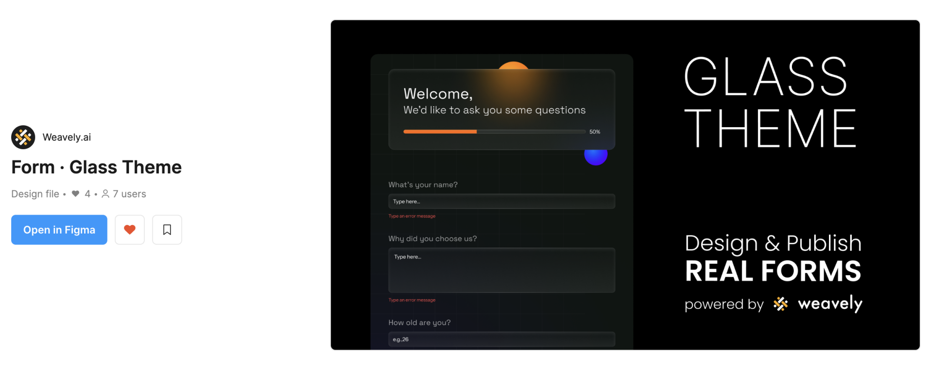
Looking to get started quickly? Check out our glassmorphism web form template in the Figma community. You can either use it as inspiration or directly publish working web forms in glassmorphism forms using our plugin.
Would you rather start designing simple glass cards in Figma from scratch? Here's a short step-by-step guide on how to do just that and spruce up your visual designs today! If you prefer video over text, here's a video detailing the steps below:
1. Use a Colorful Background
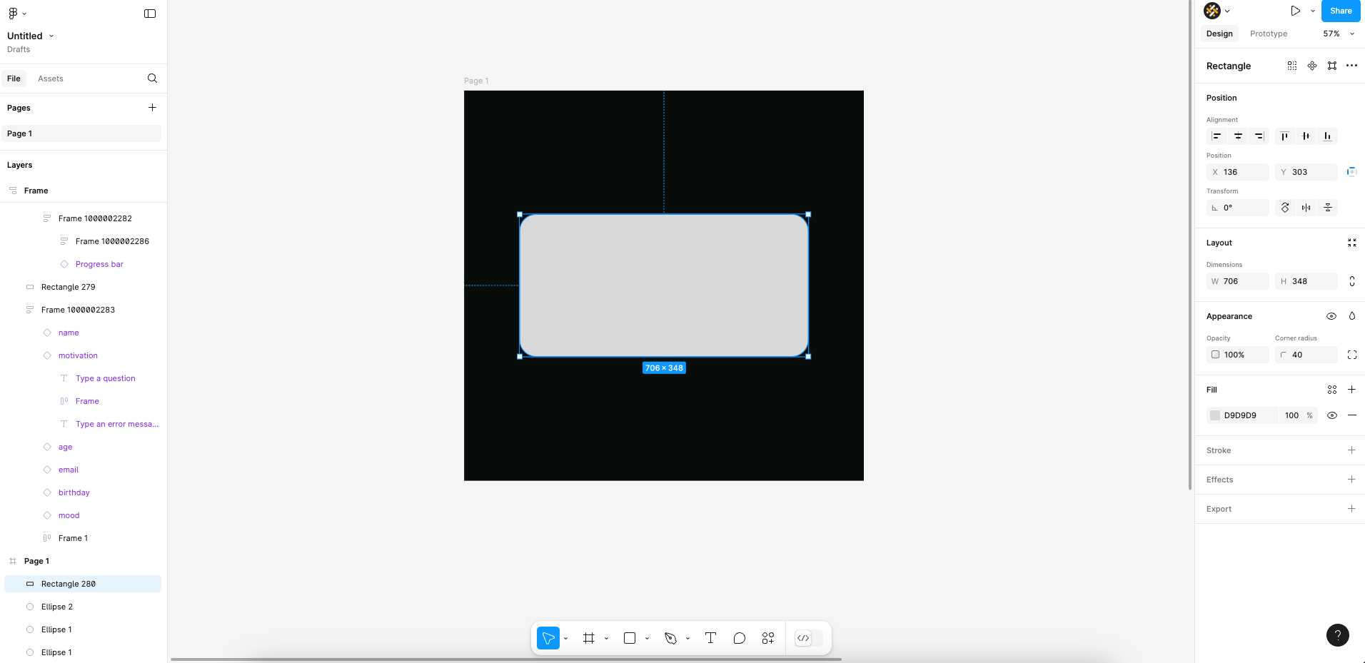
The choice of background is crucial to the success of your glassmorphism design. To emphasise the blur effect, it's important to select a background that complements it well. Typically this involves having elements of various (bright) colours in your background . Gradient backdrops typically do the trick. But, in our simple example we'll be using a unified black background. To which we'll add some gradient-coloured circles in Figma.

2. Creating the Glass Card
The glass effect is typically applied to specific glassmorphic elements . And more specifically cards in your visual design which will contain particular information. You're pretty much free to create whatever shape element you want. We'll create a simple card (i.e. a rectangle) with some rounded corners and add it on top of our colourful orbs.
3. Card Color and Opacity
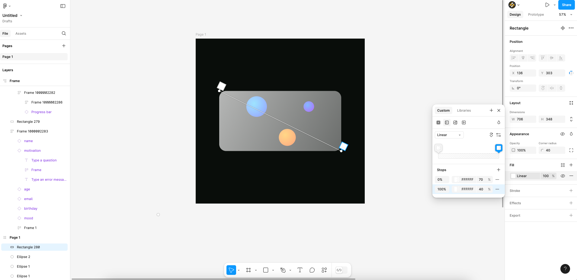
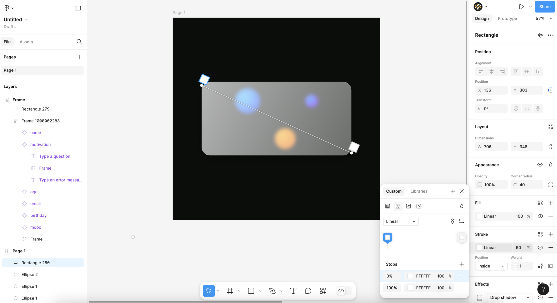
Next up you'll need to change the colour of your card. Instead of having a solid fill you'll need to apply a linear gradient. The gradient will be entirely white, but should vary in opacity (e.g. 70% on one end and 40% on the other). In our opinion the best result is achieved by making sure the gradient runs diagonally across your card as such:
4. Setting Background Blur and Drop Shadow Effects
You can already see the premises of glassmorphism in our card, but we're not there yet. You'll also need to add the background blur effect to the rectangle. You can vary the level of blur depending on your personal taste and depending on the rest of your design.
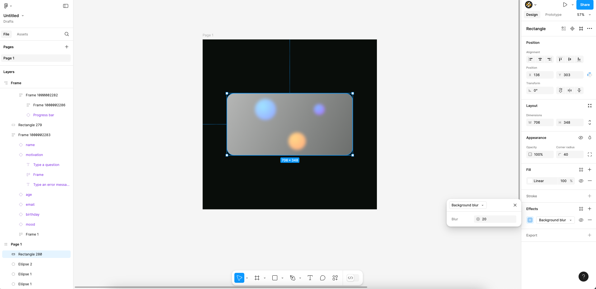
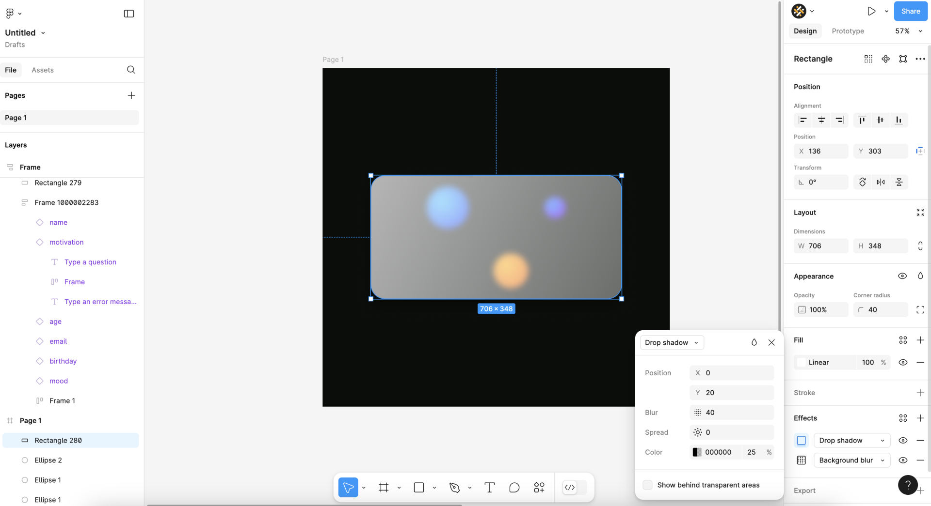
Finally, adding a drop shadow effect will further make your card stand out against the background. Though to be fair, this is less visible in our example given that our background is pitch black!
5. Final Touch
It's a detail often overlooked in tutorials on glassmorphism. But, to really finish your glass design it's advised to add a stroke around your glassmorphic element. The idea is to mimic the sharp edges of glass, which is kind of what glass is known for! Simply add an inside stroke to your card, and set the colour to gradient white. You can soften the edges by varying the general opacity of the stroke, for example we set it to 60% in the screenshot below.
Accessibility of Glassmorphism
Some argue that glassmorphism can pose significant challenges when it comes to complying accessibility. More specifically it's the transparency and blur of elements, typical for glassmorphism, that can be an issue with regards to accessibility. These elements can reduce contrast between text and background, making it difficult for users with visual impairments to read content and identify interactive elements.
However, we agree with Michal Malewicz when it comes to accessibility and visual design trends. In other words, there are no accessible or non-accessible design trends. And, as such, glassmorphism isn't inherently non-accessible. Instead, designers should first focus on making core UI elements accessible. Only then should they let themselves be inspired by specific trends to design the decorations around those UI elements. If you want to read more about this way of viewing design trends we highly recommend you to read his medium article about it.
Glassmorphic Design Examples
You can find glassmorphic design examples across the internet. Ranging from entire designs of websites to small parts of the ui design for massive operating systems, glassmorphism can truly be found everywhere! Even more so, there's a plethora of glassmorphism css generators (e.g. here, there, everywhere! ).
Here's our selection of some notable glass designs:
macOS Big Sur
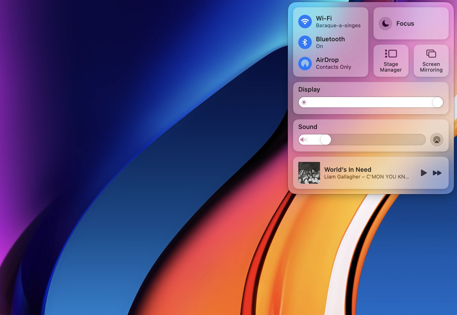
Apple integrated glassmorphism in its macOS Big Sur interface, particularly in the menu bar, notification cards and various app interfaces. The frosted glass effect provides depth and hierarchy. This creates a visually appealing and cohesive look across the operating system while maintaining usability.
Weavely Forms
Weavely.ai is an AI-powered form builder that offers a lot of flexibility in form design customisation. The tool also offers a built-in glassmorphism form template. This way, you can apply a glassmorphic effect on any form or survey you create in Weavely!
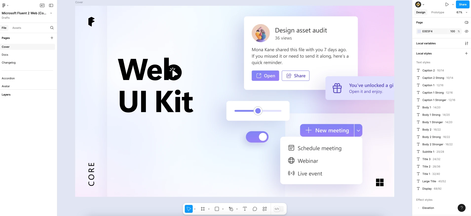
Microsoft Fluent Design Systems
Microsoft's Fluent Design System incorporates glassmorphism through its acrylic material effect, especially in Windows 10 applications. This design choice enhances menus, sidebars, and overlays, contributing to a sense of depth and focus that improves overall usability. The example below is taken from the official Figma UI kit for Fluent 2.
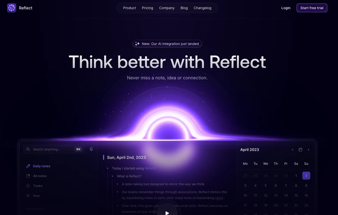
Reflect
Reflect features a sleek design that incorporates glassmorphism to create a polished user experience. The translucent elements and blurred backgrounds enhance the overall aesthetic, making navigation smooth and visually appealing.
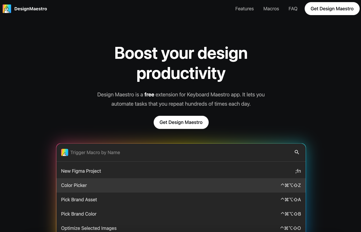
Design Maestro
Design Maestro offers a vivid glassmorphic experience with bright colours and engaging content. This website demonstrates how glassmorphism can be used to create visually striking designs that capture user attention.
Skeuomorphism vs. Flat Design vs. Neumorphism vs. Glassmorphism
Skeuomorphism is one of the earliest ui design trends, designed to imitate real-world objects and textures. It uses shadows, gradients, and intricate details to create a sense of familiarity for users transitioning from physical to digital environments. However, skeuomorphism can lead to visually cluttered interfaces although it was effective in helping users understand functionality through recognisable forms.
In contrast, flat design emerged as a response to the complexity of skeuomorphism. It embraces simplicity by eliminating shadows and textures in favour of clean lines and lively colours. This minimalist aesthetic enhances usability across various devices but can sometimes feel too stark or lacking in depth. Neumorphism is a modern evolution that combines elements of both skeuomorphism and flat design. It introduces soft shadows and highlights to create a tactile feel, simulating physical buttons and surfaces while maintaining minimalistic colour schemes.
Finally, glassmorphism takes transparency and layering to the next level. It utilises blurred backgrounds and frosted glass effects to create depth and visual hierarchy without overwhelming users.
Each style has its strengths and weaknesses. It's therefore essential for UX designers to choose the right approach based on their project's goals and user needs.

